Ladies, have you seen the TV show “What NOT To Wear”? There are “rules” for picking out clothes for yourself. You should select items that flatter and play up your assets. And on the flip side…. stay away from clothes that draw attention to your flaws. And guess what??? I use the SAME RULE when I am looking at purchasing furniture to paint and sell. I try to find pieces with something special about them. And then play those areas up.
For example, this little endtable as a recessed top on it. So that means it’s sunk in just a half inch or so. That’s a PERFECT piece for using Mod Podge to apply decorative tissue paper in. You didn’t know you could do that, did you? Oh yes, we Mod Podge furniture all the time!
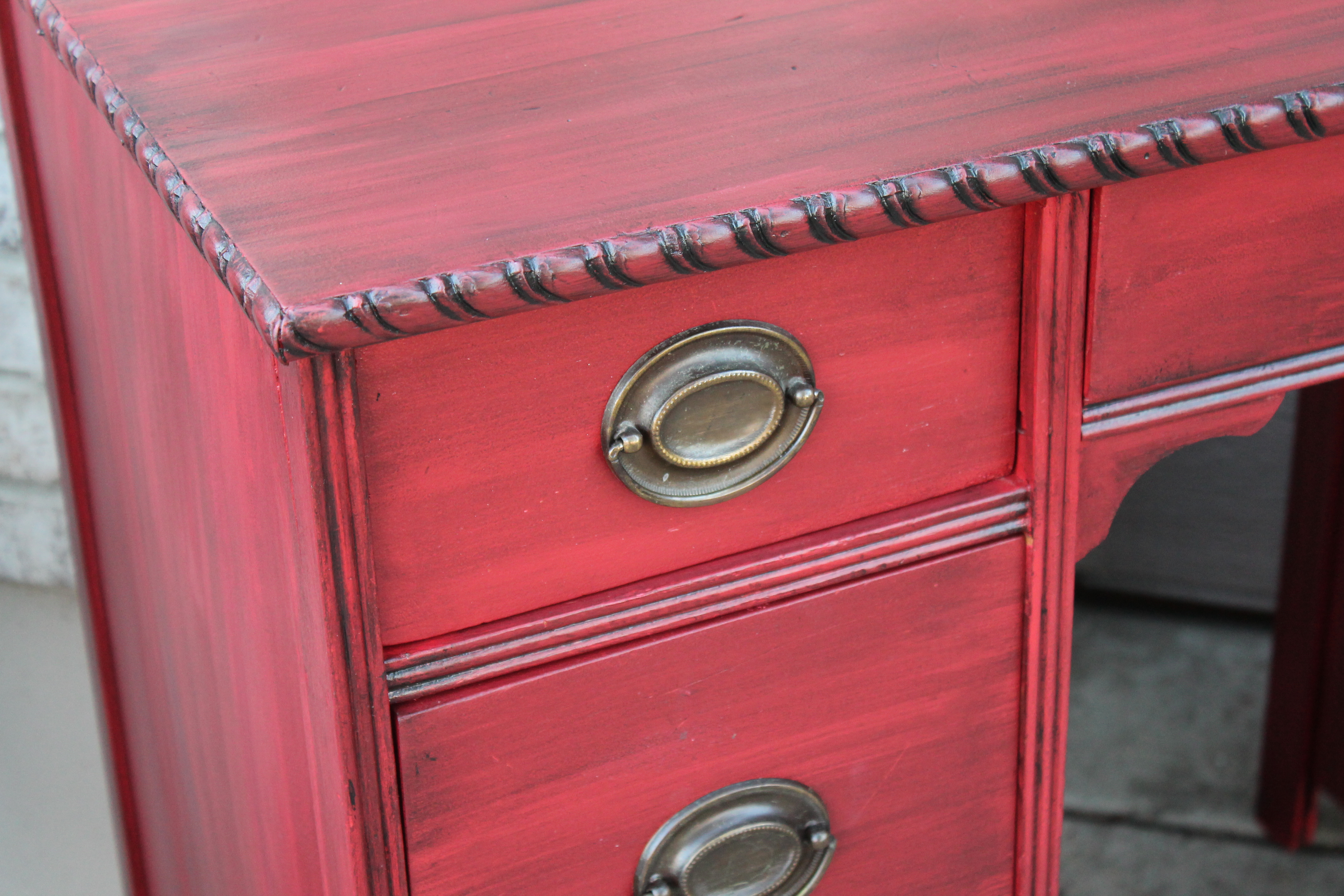
This desk hds great rope trim on it. So we HEAVILY glazed it with black to really make that trim pop. Had we just left the desk red with no glaze, the trim would have went unnoticed. We were playing up the assets!

This buffet had recessed drawers on it. So, we Mod Podged scrapbook paper into the recessed areas to add a pattern. And notice the top and the bottom of the piece are stained wood while the middle of the piece is painted and glazed. I love mixing wood and paint. So much more interesting than just wood. Or just paint.

This piece has awesome trim and detailing on it….so I left some of that alone when I crackled the rest of the piece. That way….those details pop against my faux. Now you notice it!
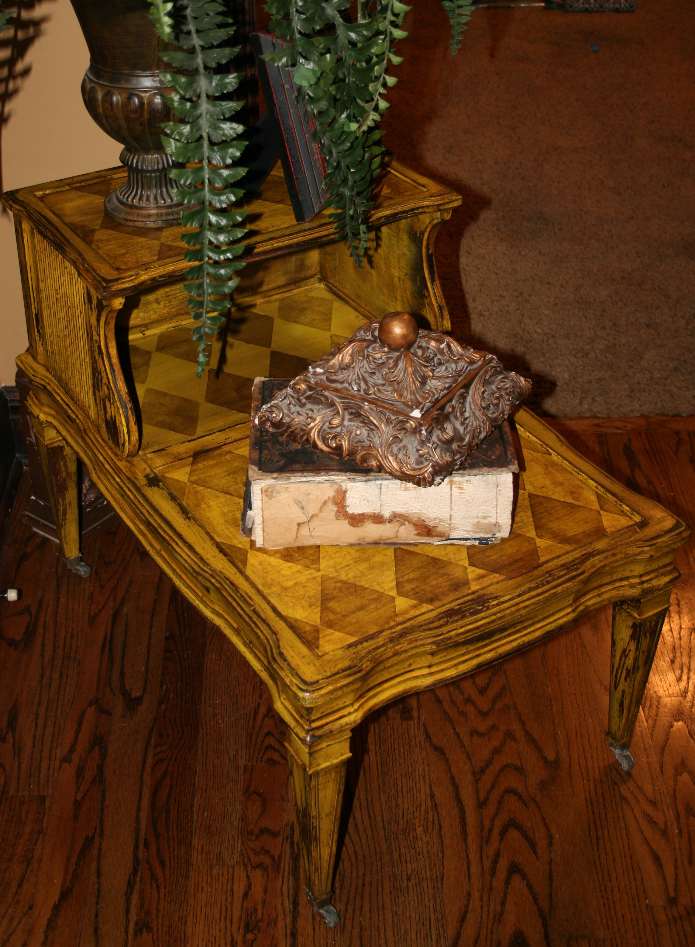
Another piece with recessed tops on it.
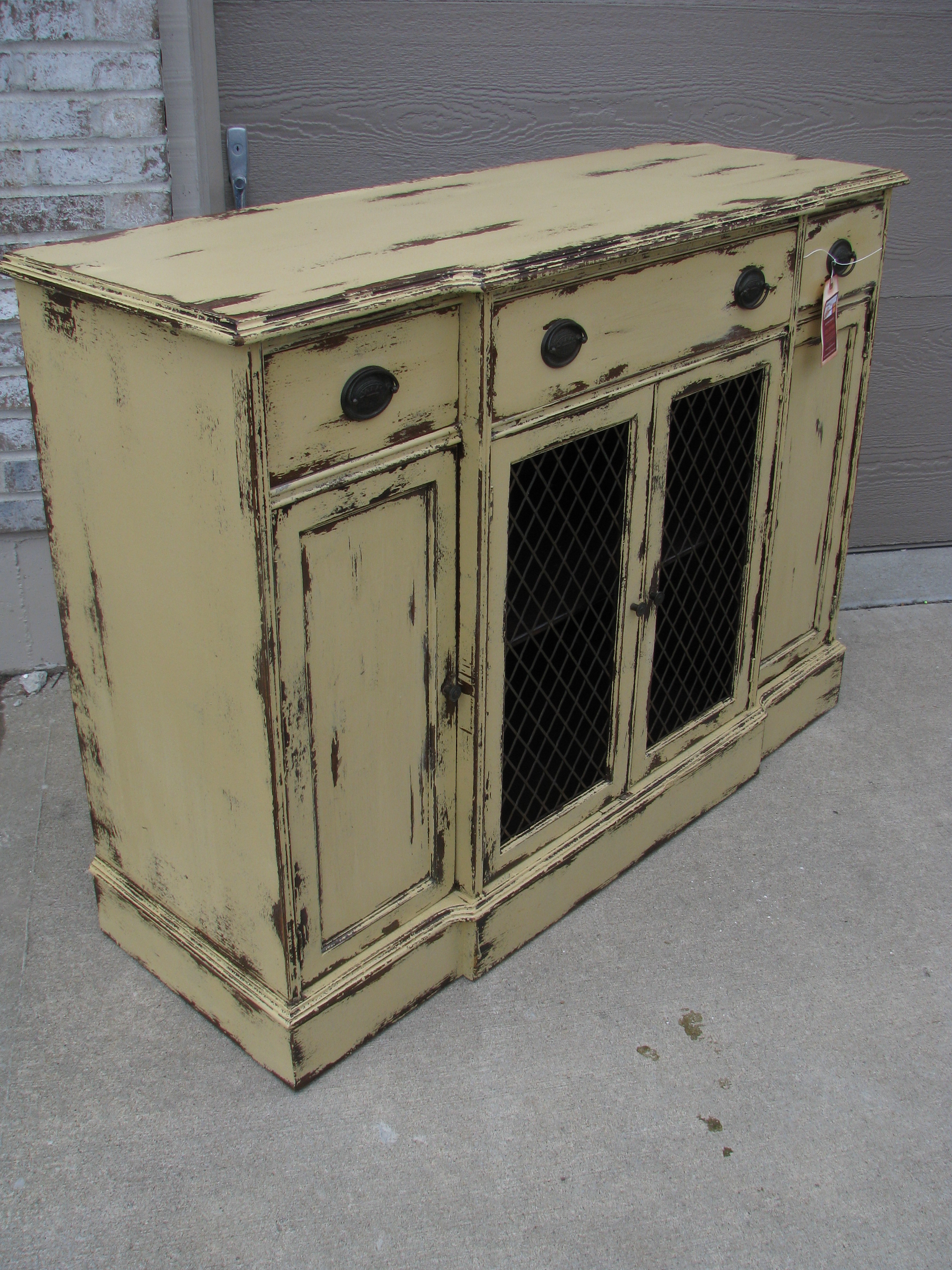
This buffet had the coolest chicken wire doors that were really dark wiring. So, we painted the piece in a light color so that the chicken wire would really pop against the butter color and we distressed it a ton. The distressing revealed the original wood color below which matches nicely with the dark chicken wire!
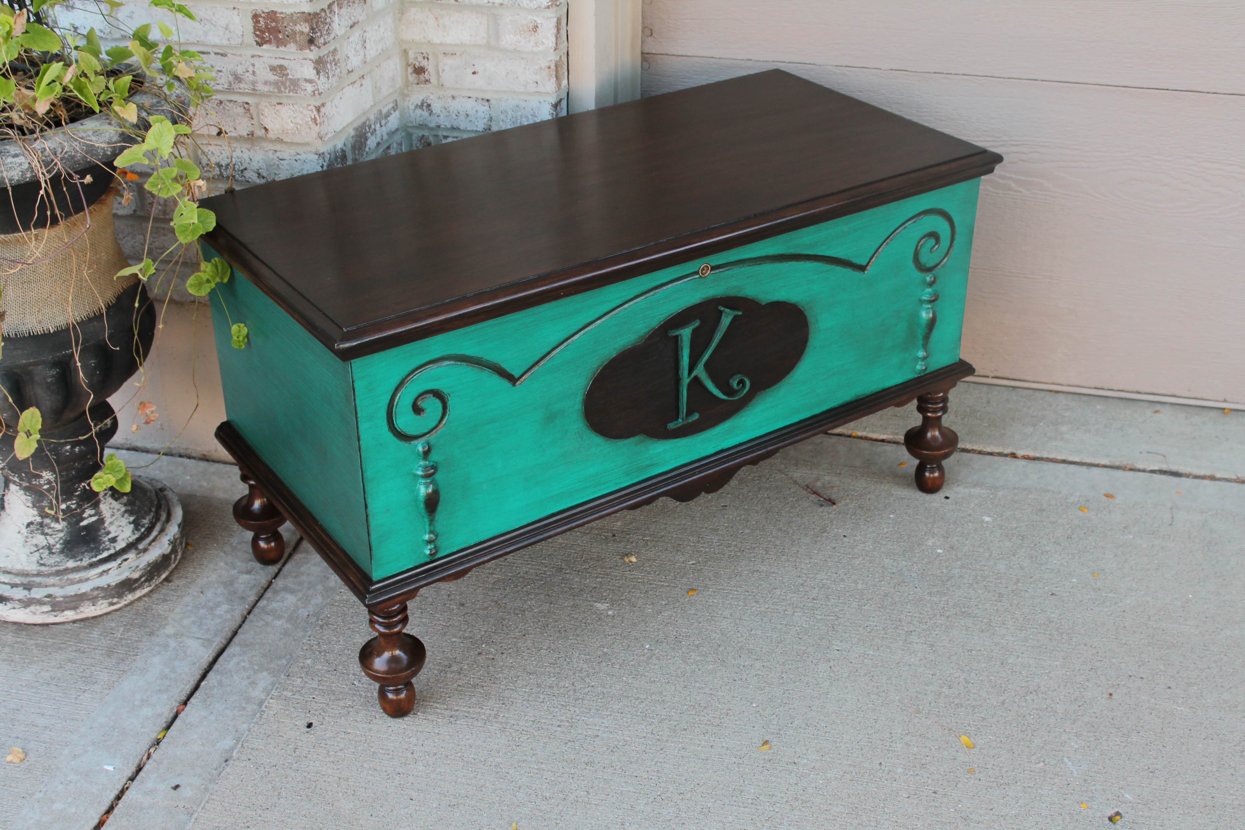
This chest had some cool detailing on the front of it. I love mixing stain with paint, so I suggested to our client that we stain the top and bottom dark and add her last name initial to the bubble on the front.
Again we are trying to draw attention to the details that we want people to look at. Play up a piece’s assets!!!
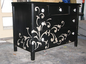
Now on the flip side of that, if I have a piece of furniture that has no real “interest factor” to it, then I try to make something happen on it. Its like dressing up a very basic (and what could be boring) outfit with great shoes, slamming jewelry or a great scarf. Add something to it to make it special!
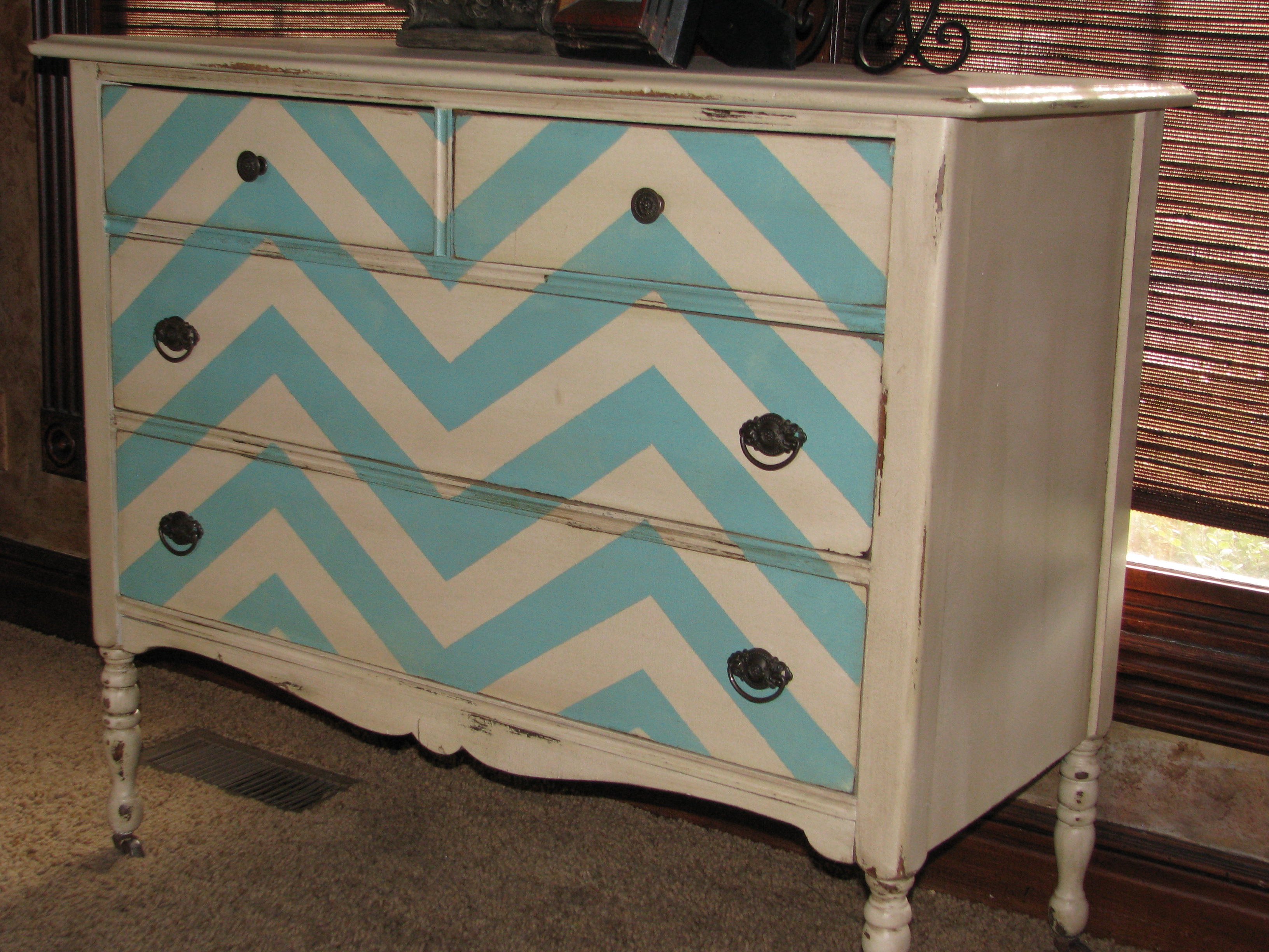
So notice on this piece that the front is completely flat. Flat front are PERFECT for a pattern. I taped and painted the chevron pattern on it.
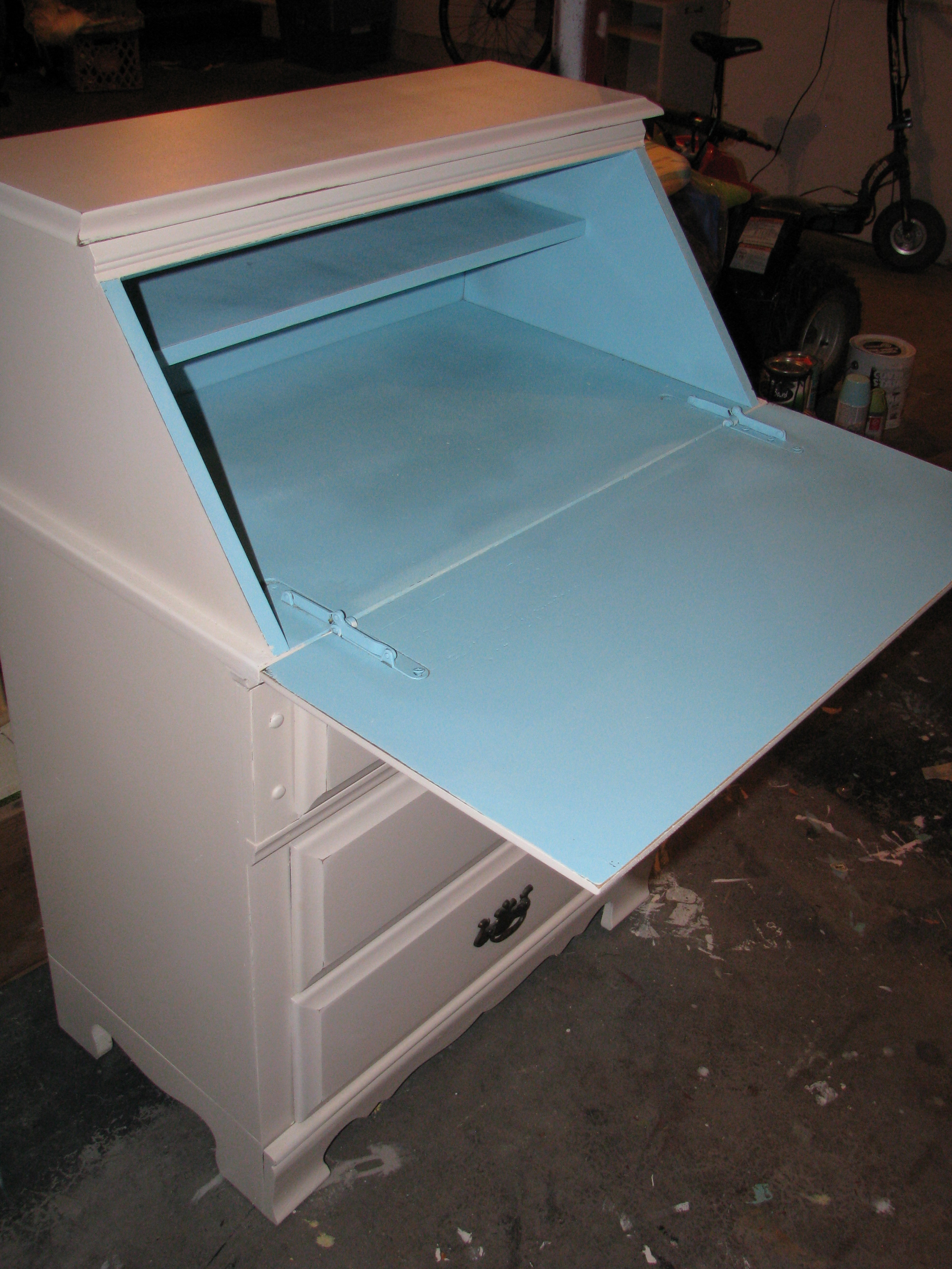
This piece had nothing special on the outside of it at all, so we painted the inside of it a stunning blue! What a great surprise when you opened the door on it!
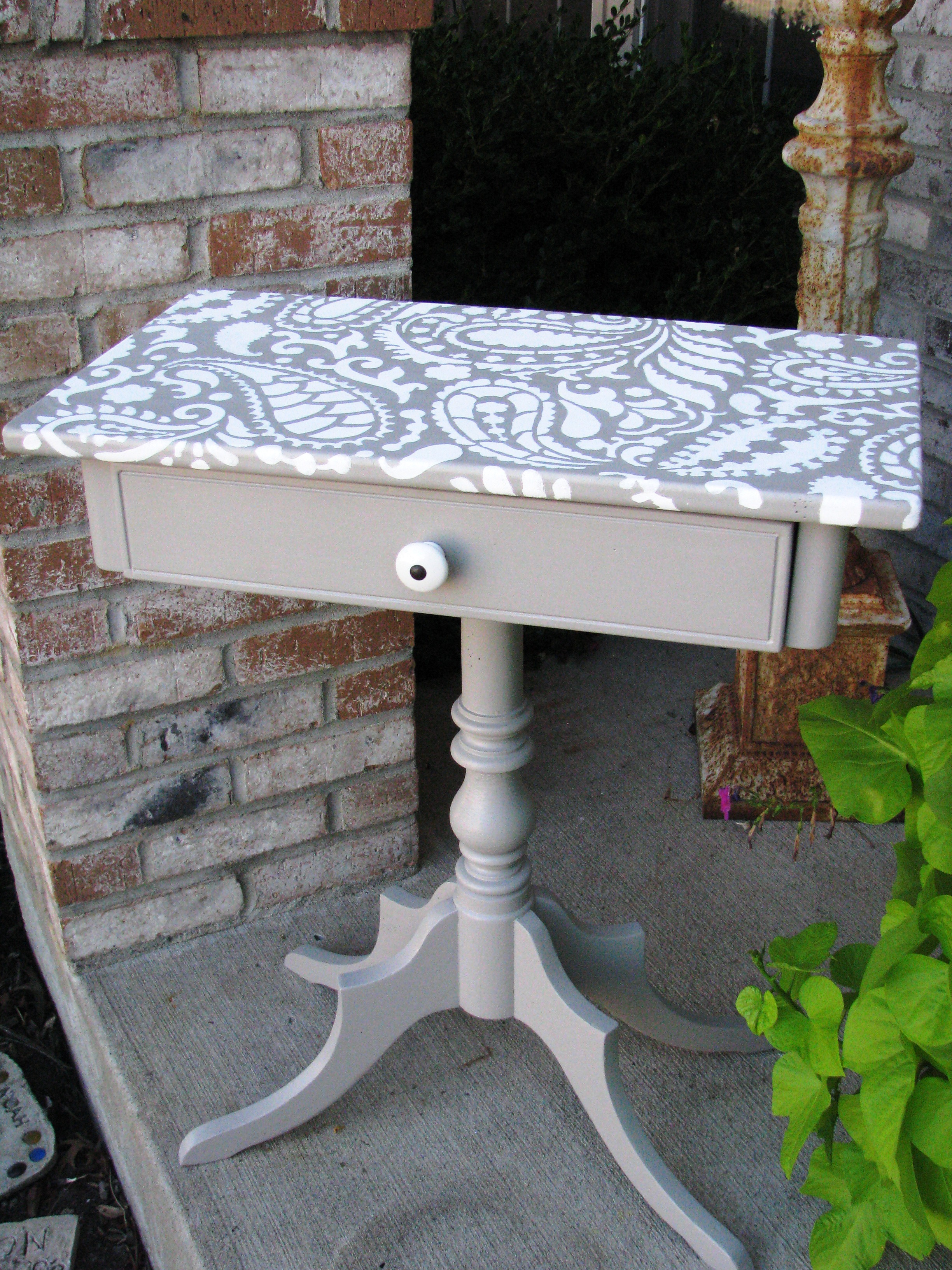
This endtable was cute just painted in a plain gray. But the paisley we stenciled on top of it simply made the piece!
Here is another piece with a boring, flat front. And…one of the drawers had a crack in it. So, I stenciled a silver design right over and now there is SOMETHING interesting about it!

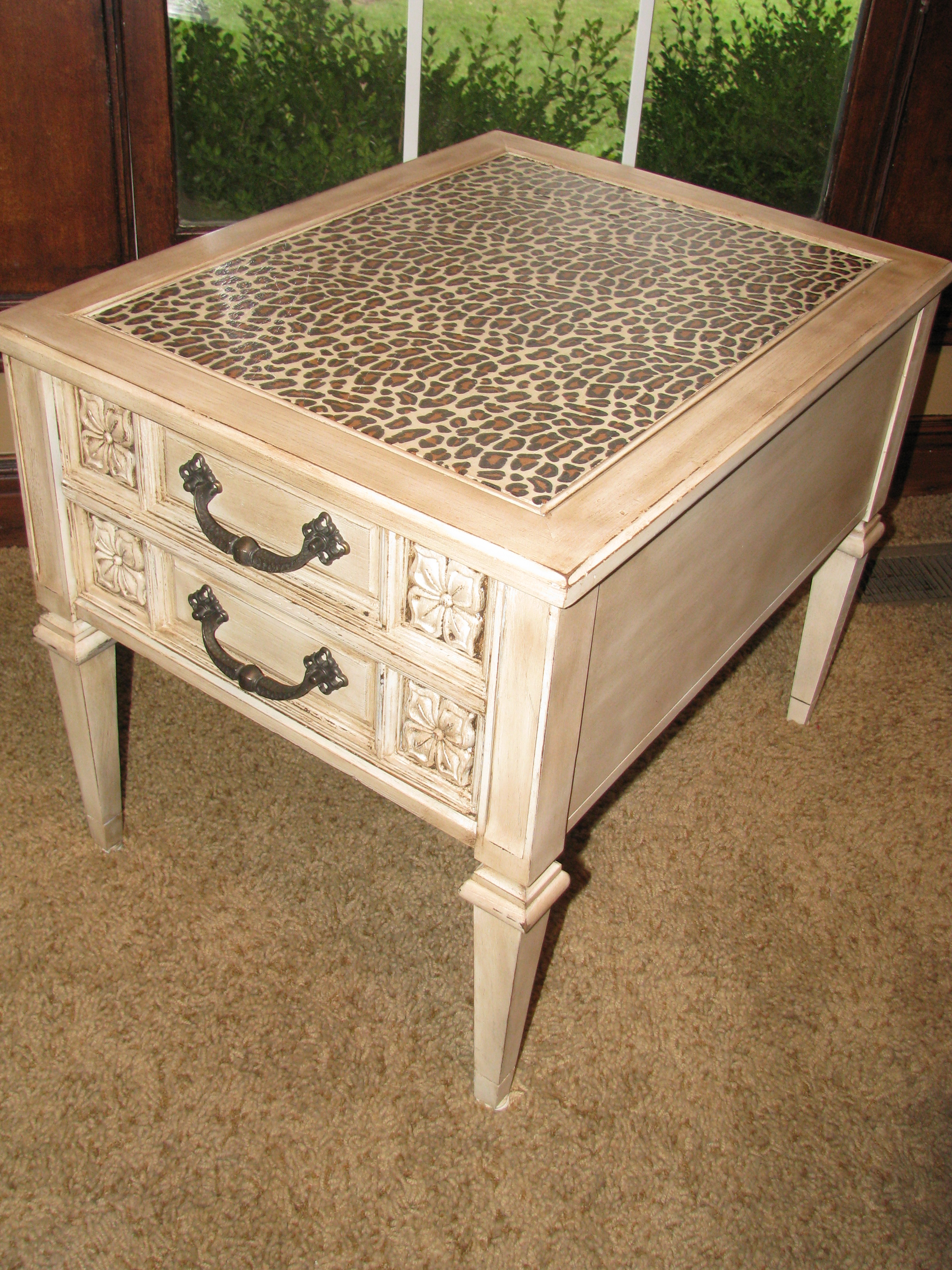
And finally, if you aren’t sure what assets to play up on a piece then just add great knobs!!! Great knobs are like earrings to an outfit!!! My favorite place for knobs is HOBBY LOBBY!!!!! They are so fun and funky! Go check them out.
Hopefully you’ve seen some good visuals and received some inspiration on painting a piece of furniture on your own. I plan on making several more DIY videos on the “How To’s” of painting a piece yourself….but until then, let your imagination run wild with ideas!
Many blessings,
Jennifer
PS….if you would like to receive all of my blog posts directly to your inbox, enter your email address at the top of this page in the turquoise box. Just once is enough. Thanks much!
Great advice and ideas! Can you offer suggestions on good places for stencils? I looked at the Mad Stencilist and just didn’t find what I was looking for. Any others? Large letter stencils? Thank you for all you do! You’re a joyful inspiration!
Help, I painted my coffee table and used outside modge podge its been a week and it’s super tacky. Do I have to sand it all off? Any suggestions?
Thank you